
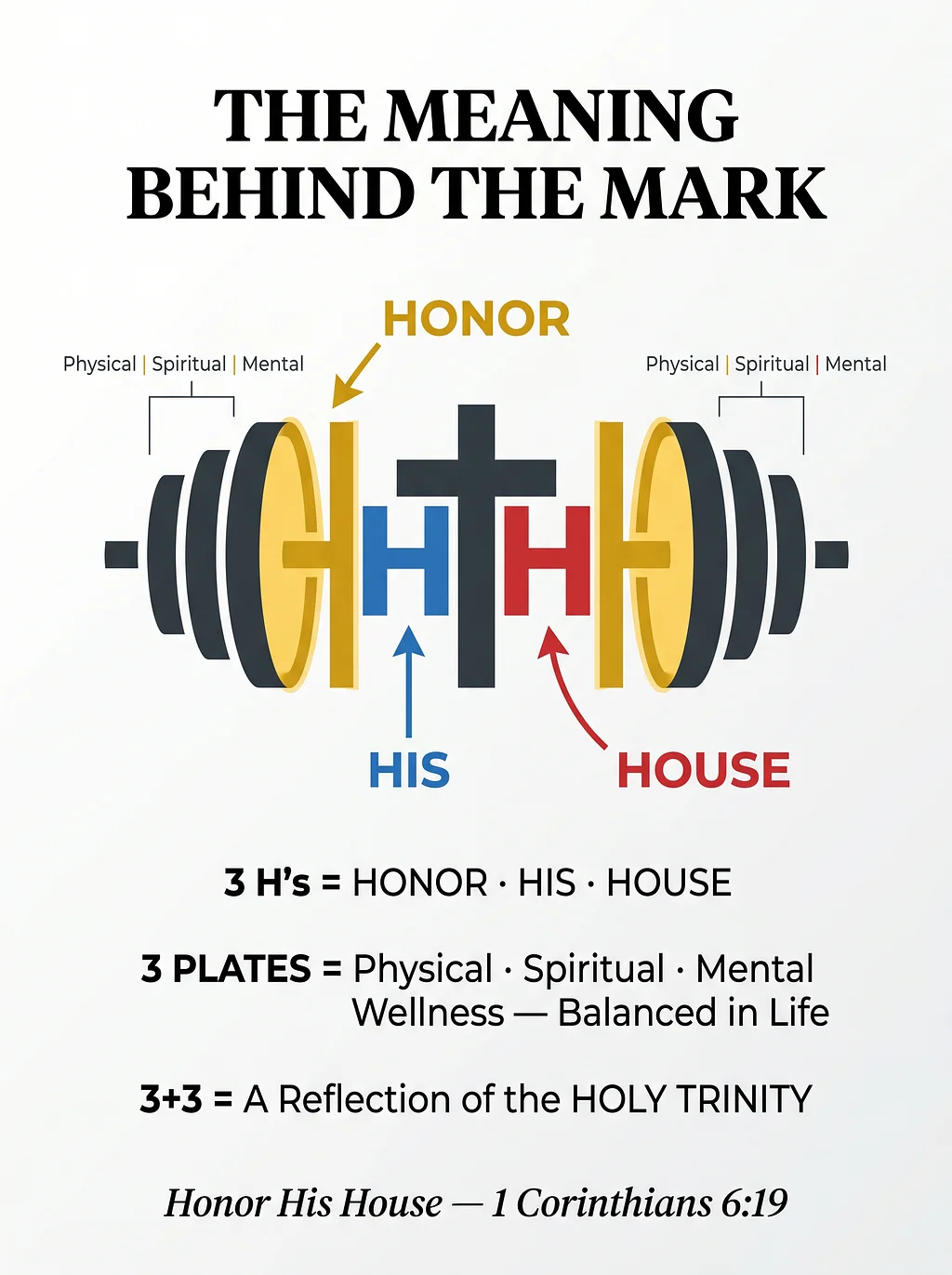
Our logo is far more than just a brand mark—it's a visual story intentionally crafted to merge high-performance fitness with deep Christian faith.
At the center of the design sits a stylized barbell, where the steel bar is perfectly intersected by a vertical Christian cross. But the real magic lies in how the structural lines come together to form three distinct H's, each carrying a profound meaning:
- The First 'H' (Honor)Formed between the two dominant inner plates, representing our call to live with honor.
- The Second 'H' (His)Created between the left plate and the left side of the cross, grounding us in whose we are.
- The Third 'H' (House)Built between the right side of the cross and the right plate, completing our name and mission.
To make this story easy to follow in our graphics, we've highlighted these layers with clean, modern accents— HONOR is called out in a bold yellow, HIS in a sharp blue, and HOUSE in a striking red.
Every single detail has a purpose. The three barbell plates stacked on each side symbolize the vital balance of Physical, Mental, and Spiritual wellness. When you look at the total design, those 3+3 plates serve as a powerful reflection of the Holy Trinity.
Ultimately, every element of the His House logo points back to 1 Corinthians 6:19. It is a daily, wearable reminder to honor the temple we've been given, blending holistic wellbeing with an unwavering foundation of faith.